NOTE: We had a great training recently on booking more gigs through your website and it’s now available for FREE on YouTube…
Recently, I spent some time on the websites of several musicians, storytellers, and performing artists.
41 of them, to be exact.
I had offered a free marketing review to one subscriber of this blog, and got that many entries over a twelve hour period.
So, one random winner was selected, and I’ve now completed a video review of their website with lots of good marketing tips and advice.
But as I checked out all the other entries, I started to see some common mistakes, so . . .
 One thing led to another, and I just did it.
I ended up reviewing all 41 of the websites, judging each one on twelve different criteria, and then tallying up the results.
Here’s exactly what I found…
The Great News on Artist Websites
Mobile Responsiveness – 95%
Slightly more than half of all website visits are now happening on a mobile device, so I was very glad to see that 95% of the sites I evaluated were mobile friendly.
 Optimizing your website for mobile access is absolutely mandatory today, and in fact, Google is now penalizing websites that aren’t mobile responsive by burying them in the mobile search results.
Not sure if your site is mobile responsive?
Pull out your (or a friend’s) smartphone, and take a look at your website:
- is the text large enough?
- is the content rearranged to fit the mobile screen (hopefully), or do you have to scroll left and right to read it (not good)?
- are the images resized?
Or, if you simply type your web address into Google’s own Mobile-Friendly Test, the Google lords will do the rest.
The Good News
Ease of Navigation – 78%
DISCLAIMER: This is the first of several subjective criteria I used to evaluate these websites. For example, my idea of what’s easy to navigate may not be the same as yours, or your visitor’s. What I tried to do is approach each artist’s site as a visitor who might be interested in booking them for a gig, and I erred on the side of being somewhat unsophisticated in my web use and navigation skills, as some of your visitors will be.
78% of the sites I visited were easy to navigate, which was a pleasant surprise, as I’ve been on plenty of websites over the years – you probably have too – where it was just impossible to find what I was looking for.
 (Some school district sites come to mind…).
The 22% that didn’t make the cut here were either jam-packed with links all over the home page (see below under “Effective Home Page” for why that’s not a great idea), or had bunches of drop-down menus that a) interrupt the flow of the experience, b) make it difficult for search engines to find them, and c) are generally not a best practice.
The Not-So-Good News on Artist Websites
Visually Pleasing – 51%
Subjective? Highly.
Still, I saw too many of what I can only describe as amateur-looking sites.
Small grainy photos
Poor organization of content
Multiple colored FONTS in ALL different SIZES with tons of exclamation points!!!!!
Back in the early days of the web, those of us without significant budgets for web design often ended up with substandard-looking results, or even trying to slap our own sites together.
Today, that’s all changed. There are tons of free and low-cost platforms out there making it real easy to add text and photos to already-well-designed (and sometimes beautiful) templates. A few that I’m aware of are Bandzoogle, Wix, and Squarespace, but there are dozens more.
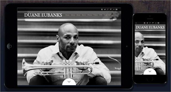
One of Bandzoogle’s many templates
There’s simply no excuse anymore for not having a professional looking website, even if money is very tight.
Like it or not, your website visitor is drawing conclusions about the quality of your performances based on the look and feel of your website. It starts happening the second they land there, and without them necessarily even thinking about it.
Think about that.
Effective Home Page – 41%
Take a look at your own home page for a minute. Is it clear what you want your visitor to do?
Or, are you giving them 17 things to look at? News articles, quotes, photos with captions, dozens of links, graphics for performances that you offer, invitations to like you on social media and join your email list and come to your next show and buy a CD and read everything anyone’s every written about you and….
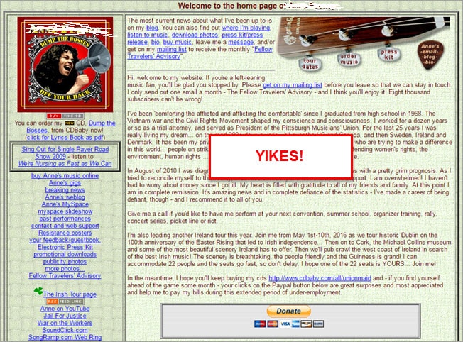 Now scroll to the bottom of your home page, where many of your visitors will end up within a matter of seconds.
Are you guiding them to the next logical part of your website, or is it a dead end? Is the thing you most want them to know, or do, prominently featured there?
The purpose of your “Home” page, plain and simple, is to help people get to the information they need as quickly as possible. Only 41% of the sites I looked at were doing that well.
Just as too many choices can make it hard to order a donut (unless peanut is one of them…), too many competing elements will confuse your website visitor and make them want to leave.
“In most cases, less is more in terms of website content. A cluttered website is often a confusing website.”
-Chandler Coyle, Music Business Instructor at Berklee Online
Noise is your enemy, and clarity is your friend.
Putting Benefits First – 41%
If you’ve been a reader here for some time, you’ve heard this before.
Most of us promote ourselves by talking about . . . ourselves. A lot. It makes perfect sense, of course, but completely ignores the fact that our website visitor cares way more about themself than they do about us.
They’re on our website because of a need that they have.
What does your website visitor need? Why are they checking you out? The better we can take our “features” (which are about us) and turn them into “benefits” (which are about them), the more effective our marketing is.
For more on that, check out the article Want Better Gigs? It’s Not About You.
Effective Use of Testimonials – 34%
“Where should I put all those great things that people have said about me over the years? I know – I’ll make a separate page where people can see all of them!”
– Every Beginning Website Builder, Everywhere
It’s perfectly logical to take all the most powerful quotes, reviews, and testimonials you’ve accumulated and put them together on a dedicated page called “Testimonials,” or “What People Are Saying,” or “Reviews.”
The problem is that very few of your website visitors go to those pages. Think about it. Why would they? Those pages smell like marketing, and nobody wants to be marketed to.
In fact, do you visit those pages when you’re on somebody else’s website? Probably not.
 A far more effective use of your testimonials is to sprinkle them on the most important and highly-trafficked pages of your site.
If someone is considering booking you, they’re probably going to spend some time on the page that describes your shows, and/or your “Booking Info” page, or “Pricing.” Using your website analytics can help you quickly determine what your most visited pages are.
Those are the places to strategically place your testimonials. Your goal is to support your visitor in deciding that you are a great choice for them. Why bury those powerful bits of social proof where they’ll never be seen?
Email Capture (at all) – 34%
Fully two-thirds of the websites I looked at were missing an easy opportunity to capture, and stay in touch with, at least a small percentage of their website visitors.
As far as I’m concerned, there’s no reason not to have an email signup form on your website. Better if you can also ask them to check a box letting you know whether they are a “fan” or someone who may be interested in hiring you at some point – handy stuff to know for your future communication.
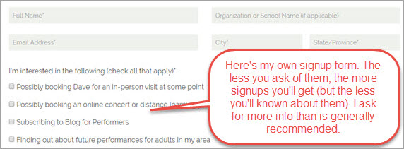 But at the very least, give your visitor the opportunity to provide their email address in exchange for something of value. See below under “Email Capture (effectively)” for tips on optimizing your email signups.
The Terrible News
Good Scanability – 22%
Ouch! What I was looking for here was an easy, pleasant browsing experience where I didn’t feel overwhelmed by large blocks of text or confused by too many competing elements.
A best practice is to use bite-sized sections of text (no more than three or four lines per paragraph) broken up with images and other elements that support your message and keep your visitor flowing freely through your site.
(I’d prefer that the text be larger on the following example, but still, this is far more scannable than most…)
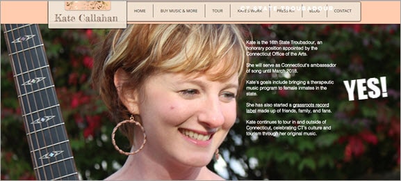 Unfortunately, close to 80% of the sites I looked at were not accomplishing this.
Again, think about how you feel when you’re on a website that’s asking you to read a huge chunk of words:
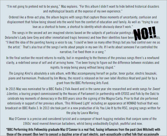 Do you read it? Of course not. Very few people do. It’s too much work. Don’t make your visitor work too hard.
Clear Call to Action – 19%
If our visitors don’t know what we want them to do, they probably won’t do it. Only 19% of the artists’ sites I looked at made it clear what they wanted their visitor to do.
What you want your website visitor to do? You may have several different goals depending on which page they’re on, and that’s perfectly fine. Just make sure you’re telling your visitor to take that action on each of those pages.
Maybe it’s “Contact Me About a Booking,” or “Download the Recordings Here,” or “Watch a Performance.”
 Think through the actual goals of your site, and then make sure your messages are structured to accomplish those goals.
Email Capture (effectively) – 19%
It was mentioned above that only 34% of the sites I looked at had an email signup form.
Of those, just slightly more than half were doing it effectively, or at least increasing their chances of success with it.
Hint: “Join the Email List” sucks. So does “Get My Newsletter.”
Why? Because those are all about you, not them. Again, what do they want? Offer something of value to them, and your signups will improve. Depending on how compelling your offer is, sometimes dramatically.
 Would “discounts and first choice of dates” be appealing to the person checking out your booking page? Or “three free songs?” for the person on your music page? Or…I don’t know exactly what you do, but you get the idea.
How about “my five best tips for hosting a successful performance?” Would that appeal to some of the people who might be interested in booking you for a show? And would it add to your credibility as a professional, as someone who gives back, and someone who’s been part of many successful performances?
Basic Optimization for Search – 17%
Search Engine Optimization, or, “trying to get your website to appear in Google (and elsewhere) when someone is searching for what you do,” is a multi-faceted and constantly-changing field that is, for the most part, beyond the scope of this article.
With the hundreds of signals or “ranking factors” Google takes into consideration in determining which websites to display for a given search query, you can imagine that it’s easy to get pretty far into the weeds in terms of all the things we can do to help reach that holiest of grails – the top of Page 1.
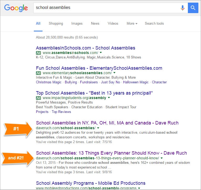 Still, there are some simple things we can all do right now to make sure that when someone’s searching for “Detroit blues bands,” or “storytellers who visit libraries in Sidmouth,” or “(whatever you do),” we appear higher in the search results.
Only 17% of the sites I looked at had taken care of the basic business of optimizing title tags and meta descriptions.
Title tag – each of your website’s pages has a title tag that is, or can be, determined by you. It’s one of the stronger signals telling the search engines what your page is about.

This actually reads “School Assemblies in NY, PA, OH, MI, MA and Canada – Dave Ruch” when fully expanded
Your title tag also happens to be the headline that gets used in the search result for that page.
 Many artists have simply left their title tags defaulting to the page name, so, “Home,” or “About,” etc. Those don’t tell the search engines anything about you and your page.
Try this – if someone was looking to hire a performer who does what you do, but they didn’t know your name, what would they search for? Make THAT your title tag, add some geography (state name, region, country, etc), and then include your own name only if there’s room.
Make your title tag different for each page, trying to capture searchers who might be looking for what it is you’re describing on that page.
Meta description – this is the few short sentences that you provide to the search engines to further explain what your page is about, and it does not appear anywhere on your site – only below the headline in the search results.
 Two goals here – describe the page using the same keywords used in the title tag (school assemblies in this case), and entice the person looking at the search results to click on your link and visit your site.
Ability to Reach Website Visitors Again on Facebook – 0%
Yikes! Really? Nobody is doing this?
Consider this – somewhere around 98% of your website visitors will never contact you or take any action on your site. You have no idea who they are, how to reach them again, or what they were interested in.
 Installing a Facebook pixel on your website is a big “win” for that very reason. Further, it’s not too difficult to accomplish, it’s free to do, and it’s extremely affordable if you ever decide to use it to stay in touch with your website visitors.
What, I can stay in touch with people who visited my site? Even if they never contacted me?
Yes. Once you’ve installed this little piece of code on your site, Facebook starts to create an “audience” of your website visitors (only the ones they recognize as having a Facebook account). You can literally set it and forget it, and when you come back a few months later, you now have a universe of people you can advertise to on Facebook – for as little as $5 a day – who already know who you are and what you do. These are some of your very best prospects.
 “Remarketing,” as this is called, is all the rage right now in digital marketing, and I can tell you that I’ve had some pretty phenomenal success with it myself.
You’ll find more information on how to get started with Facebook remarketing in the article Facebook Ads: 6 Wins for Performing Artists.
How to Accomplish All of This?
I know. I can hear what you’re thinking. How in the world am I going to get all of this done?
Well, if you’re using a website platform that allows you to make your own changes to text and content, you can do most or all of this yourself as time allows.
 If not, it would be well worth your time and investment to a) hire your web designer to do a few hours of work on your website, and also b) look into shifting to a WordPress site or any other platform that allows you to make your own changes to the content. I just made this change myself about 18 months ago, and couldn’t be happier about it.
I’d love to hear your thoughts in the Comments section below.
About The Blog
 Since leaving a white-collar marketing job in 1992, Dave Ruch has been educating and entertaining full-time in schools, historical societies and museums, folk music and concert venues, libraries, and online via distance learning programs.
Along the way, he’s learned a great deal about supporting a family of four as a musician.
The Educate and Entertain blog provides articles, tips, encouragements, and how-to’s for regional performers (in any region) interested in making a great full-time living in the arts.


Thanks for all you do to help people. This post reminded me I need to add my 4 new zoom talks I’ve created and emailed librarians about. Now I need to announce them here. I hope you get lots of gigs this year!
It’s really hard to get motivated with COVID affecting my brain **and finances** but I do appreciate the gentle NUDGE to get my website improved…… Thanks for the concrete ideas.
Now is a great time to do it!
Dave, Thank you for the email on website improvement. Though my site loads well on mobile, I realized that some of my pictures describing show content did not. Never was a problem in the past but I guess as technology and apps change, older content may not get displayed. I can’t figure out the rhyme or reason for it, so I’ve spent the last two days, changing out the offending content as well as adding other improvements. Much thanks again.
Glad to hear it Rita!
I agree with everything that you said. Thanks for your input!
Is a website absolutely essential?
Would it be possible for an entertainer to succeed without a site and market only using email and Facebook?
Hi Mark – would it be possible? Sure, Would it be easier with a website? In my opinion, almost certainly.
Thanks for the answer.
I was thinking the same as you but my wife was hoping the no website approach would work better. 🙂
Really good advice Dave. I plan on using some of these tips to improve my own website.
I enjoy your posts!
Glad to hear it Shane!
Hi Dave,
Thank you for very informative and helpful suggestions about our websites. How the world sees us as professional artists when and if they happen to click on our site is vital if we want to advertise our products and services. You shared how others might look at us for the first time through our website and it’s an eye opener! Thanks again for all you do to help us understand more about the business side of music. Robert
Thanks Robert!
Thank you, Dave, this is just what we at LANES, the NE Storytelling Organization, are looking at right now. You have covered so much territory so very well in this article!
Glad to hear that Hope! Best of luck with it.
I don’t want be a spoil-sport, but I absolutely hate Facebook, it is a huge waste of time!
And furthermore, why would I want to spend $5 a day “remarketing” to anyone…..OK I am ready to be shot down, but seriously I do not have $180 to spend on a single person who happened on my website, to maybe have a 2 percent chance they want book me for a $500 gig, most likely on a date when I am not available or in a far away location.
Dear “Micro” – to each his own with Facebook, for sure. I certainly wouldn’t recommend that anyone spend time there if they didn’t want to. The fact remains though that your audience IS there, and they’re easily reachable.
As far as the budget, I should have been more clear. $5 will allow you to reach, at least for now, a few hundred of your website visitors, not just one. As I recall, you play quite a bit for weddings. It seems to me that people “shopping” for wedding music might visit your site along with several others to see what’s out there, and they’re probably going to be making a decision sometime soon. Wouldn’t it be nice to be able to reach them again after they’ve left your site to offer something of value, or a new angle on what you do?
“Where should I put all those great things that people have said about me over the years? I know – I’ll make a separate page where people can see all of them!”
– Every Beginning Website Builder, Everywhere
Exactly.
We wrote an article on our own blog inspired by people’s misguided notion that different types of content – such as testimonials – belong on separate pages.
http://www.renouncreative.com/what-getting-dressed-can-teach-us-about-website-design/
Thanks for sharing that post Dan!
BTW everybody, Dan’s company is called Renoun Creative and they are the people that put my current website together. Anything you see that looks good is their doing, and the rest was probably messed up by me.